
You LOVE it. But you don’t know where to put it… You’re not alone. It turns out stressing about where to place and hang artwork is the number one reason people decide not to buy something they truly adore.
It is instinctual to know what you like, but it does take some skill and thought to know how to best display artwork. This post will help you understand where that masterpiece belongs in your interior. If you’re an artist, knowing how to advise a client on this subject can make a huge difference for sales.
My knowledge comes from years of owning a gallery, and a lifetime addiction to home décor magazines. Displaying artwork of different styles, colors, and textures in the perfect spot isn’t as challenging as it sounds. Though, it does take some attention to detail.
Here’s my quick list to help you understand the key elements to successfully placing art
- “Matching” is not the same as harmony
- Visual contrast is key
- Varied sizes equals more freedom
- Attitude is important for placement
- Structure produces focal points
- Framing can dominate presentation
Getting started you need to clearly define the characteristics of the artwork you’re going to place in order to narrow down where the piece will casually fit in an interior. To do that, you’ll need to pay attention to the following collection of design principles:
Lighting
What kind of lighting is in the artwork itself? Pay attention to the direction of light within the artwork. This is a good indicator of what should and shouldn’t go where. You don’t want the art to look like it’s working too hard to fit. The right location will bring out the best in the design and enhance the room. This should appear effortless.
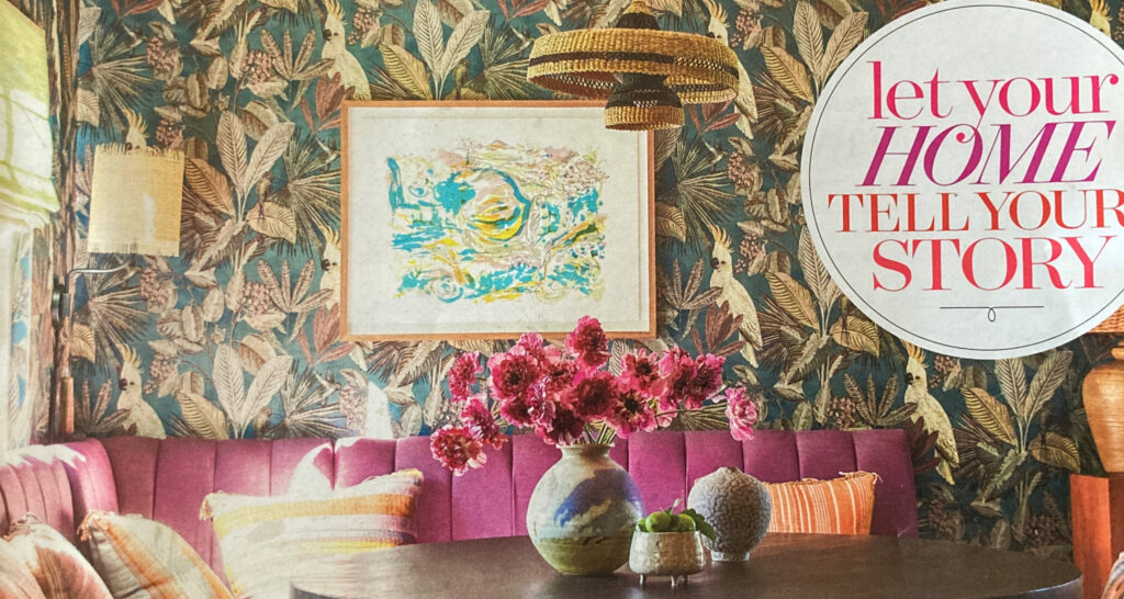
For example:
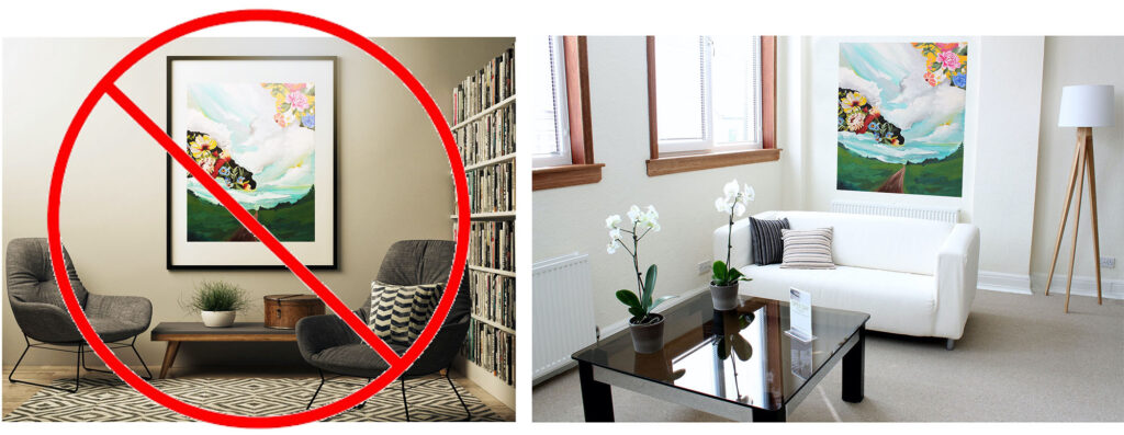
The direct overhead lighting makes this piece look darker and doesn’t bring out any of the design’s finer qualities.
The window to the left matches the movement and artistic lighting within the piece, making it look natural.
Colors
Is the artwork luminous (bright and reflective), or receding (dark and moody?) Identifying these attributes will narrow down the atmosphere that will be most flattering. Receding artwork looks powerful and purposeful in bright rooms creating an eye-catching contrast and statement. Luminous art is mesmerizing in softly lit areas creating a glow that enhances an otherwise dull spot.
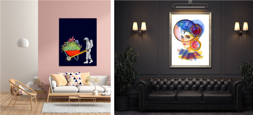
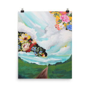
This bright interior is much more interesting with a contrasting moody print
This dark modern parlor is instantly transformed with a radiant expressive print
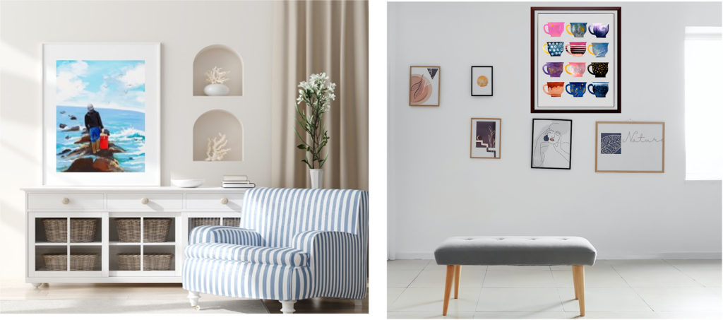
Size & space
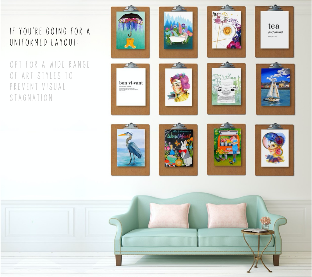
The size of the artwork you should purchase directly relates to the busyness of the design and the height of the interior. Artwork that is rife with sublime detail and patterns looks calmer when enlarged. Cluttered or highly detailed interiors look tidier when a large, relaxed artwork is added.
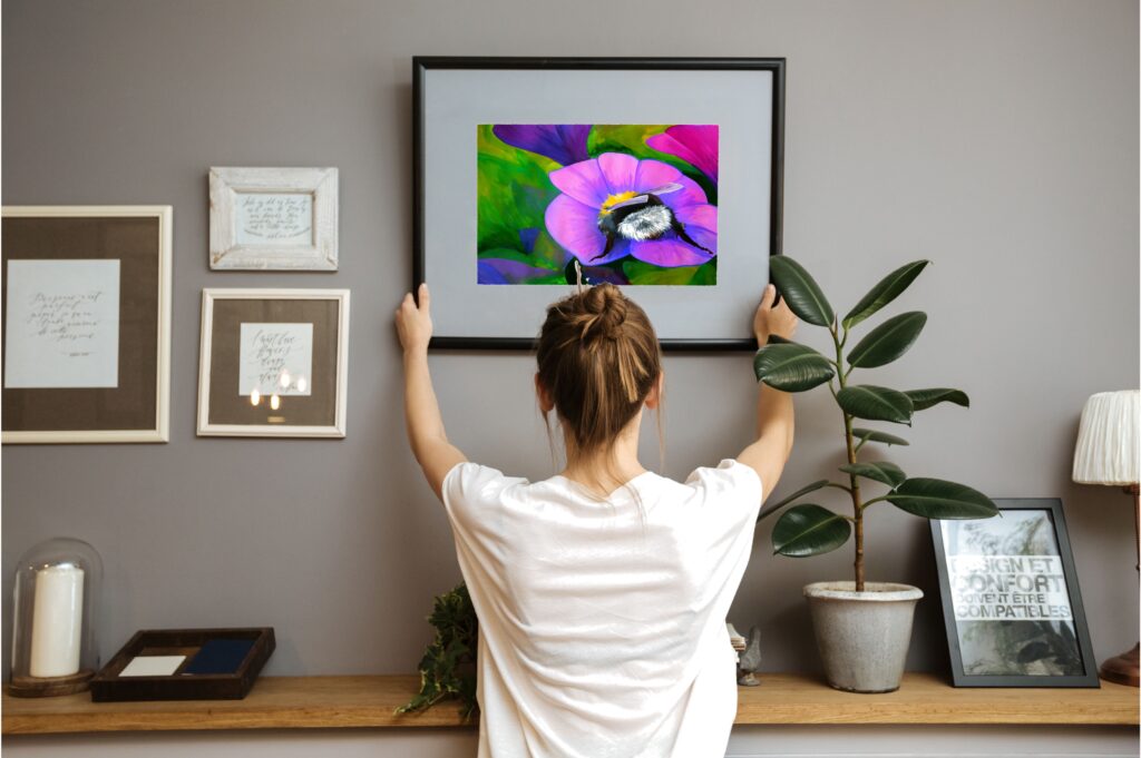
I like to use ceiling height to help me determine where on the wall to place a piece. Generally, as a rule of thumb people tend to place artwork too low. The larger the artwork, the higher it can go. Try to avoid placing artwork that creates excessive or uneven negative space. Leave no more than 2-5 inches on either side.
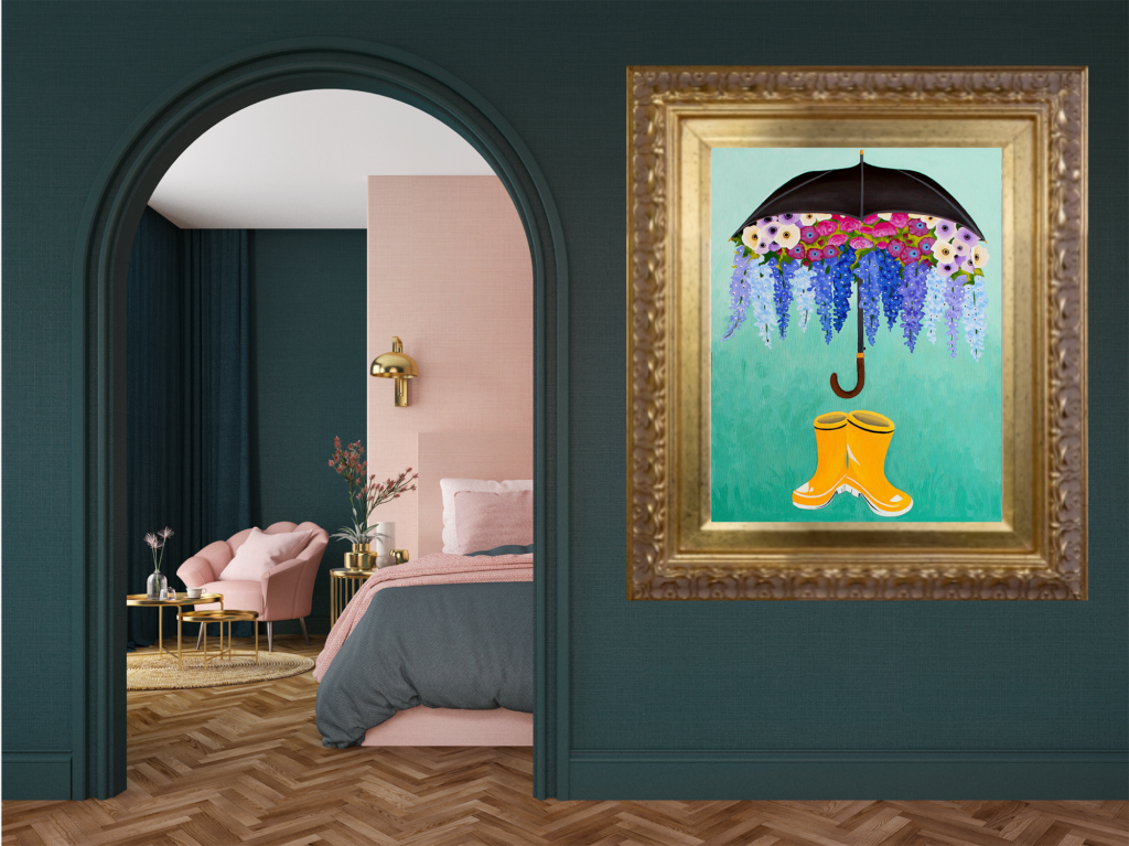
Attitude
Is this a stand-alone piece of artwork or is it a standout piece? Knowing the difference will save you a lot of trouble and frustration. A “stand-alone” piece is usually artwork that creates a statement commanding the mood of an interior. A “stand-out” piece of art looks bold in comparison to other pieces you’ve already hung but doesn’t overpower them. To determine this, you’ll have to take some consideration and stock of what your interior already has. Ask yourself if this piece of artwork will need to be next to other art, or will it be a solo hanger? Defining this key sense of attitude will immensely help you decide where to place your newfound treasure.
Structure
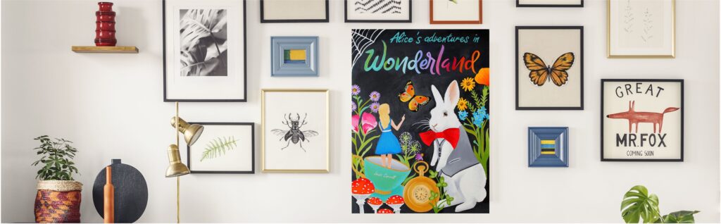
Hello geometry! Whether you’ve got a stand-alone piece or a stand-out piece your interior will thank you for using some basic geometry to create focal points. Focal points are areas of repeated shape, texture, pattern, or design that are strategically placed to form a visual pathway. It sounds more complicated than it is. I promise. Essentially you want to note any geometric shapes within the artwork. This includes (but is not limited to) the shape of the artwork itself. When examining your interior isolate similar shapes and group the artwork to echo that design.
Examples of matching structures:
The shape of the wall and the shape of the artwork
The shape of the windows and the shape of the artwork
The arch in the doorway and the round brush strokes in the artwork
Framing
Choose wisely. Luckily, you’ve got lots of choices and ways to truly customize the artwork to fit your interior. Framing options provide visual flexibility. A small busy piece can be placed higher on the walls if you add a generous oversized matting and simple frame. A large ornate frame can change the attitude of the piece or even add additional contrast. Be mindful that framing can dominate presentation, for that reason it is something I chose to do last. Once I know where a piece will best be displayed, it’s easier to select a stylish frame that will work with the location to bring out the qualities I love about the artwork.
Common mistakes to avoid when hanging artwork in your interior
- Displaying too much of the same stye of artwork
- Not varying sizes enough
- Hanging artwork unevenly (leaving unmatching amounts of space above and below)
- Selecting a frame that doesn’t embellish the best qualities of the artwork
- Disregarding the light or visual movement within the artwork
Harmony isn’t just a piece of artwork that matches the color of your couch. It is a visual balance that occurs when you have successfully styled an interior containing the appropriate amounts of contrast, repeated patterns, and thoughtful presentations. Styling a beautiful magazine-worthy room is less about matching, and more about the right items standing out in the right way.
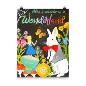
Like this post? Please pin the image below and share
I love looking at art, so I wanted to display paintings in my condo unit’s living room and create an art gallery wall. It was a helpful reminder when you told us to avoid common mistakes such as hanging the artwork unevenly by leaving spaces above and below that do not match or choosing a frame that won’t highlight the best qualities of the artwork. I’ll be sure to consider this once I find art frames to use for the paintings soon.